For their upcoming Milan-Cortina Winter Olympic sponsorship, OMEGA asked us to pitch an elevated guest and operations experience. Through creative imagery, custom layouts, and big ideas, we showed their vision was possible.
I’ve added my favorite layouts for a quick view. Please click the button to view the full document.
Note: This document is considered confidential. Do not share outside portfolio purposes.
In this pitch, CDW asked for a fully realized guest Olympic experience. We brought this to life through a custom branded deck, sleek layout design, inspiring imagery, and useful charts. My role in this project was layout design. I worked closely with the team to bring their vision to life.
I’ve added my favorite layouts for a quick view. Please click the button to view the full document.
Note: This document is considered confidential. Do not share outside portfolio purposes.
Salesforce challenged us to pitch their Paris Olympics 2024 Program. We delivered an on brand and engaging guest journey with their Salesforce House! With high custom layouts and renderings, we delivered on their request.
I’ve added my favorite layouts for a quick view. Please click the button to view the full document.
Note: This document is considered confidential. Do not share outside portfolio purposes.
Ally bank set a goal to level up their sports Partnerships portfolio. Specifically, in the NWSL/NWSLPA. They also asked us to think through the Ally Challenge as it relates to their current partnerships in Golf and impact on the Flint community. We chose to brand the deck in their visual language, then delivered our expertise in partnerships through a visually engaging presentation.
I’ve added my favorite layouts for a quick view. Please click the button to view the full document.
Note: This document is considered confidential. Do not share outside portfolio purposes.
Herbalife asked us to respond to their Sports Marketing RFP. They challenged us to consider upcoming large events, and how they can become a relevant part of the conversation. We delivered a well thought out strategy, brought to life through charts, graphs, and impactful imagery.
I’ve added my favorite layouts for a quick view. Please click the button to view the full document.
Note: This document is considered confidential. Do not share outside portfolio purposes.
Manchester City FC’s goal is to “breakthrough”, creating legacy fans in the United States. Further, the aimed to engage non-sports fans. We took on this ambitious goal and recommended our approach. The design approach simplifies these ideas in an easy to understand layout.
I’ve added my favorite layouts for a quick view. Please click the button to view the full document.
Note: This document is considered confidential. Do not share outside portfolio purposes.
Sweet Pea is a women’s bodybuilding apparel company! They wanted to create a brand that was very unique and catered to their niche audience. The overall tone and neon colors were inspired by classic 70s workout videos. The brand was used across on their website, social media, and multiple pieces of apparel.
Note: these photography belong to Photos by Claire Elizabeth (Claire Perrigo)
Across GMR’s social media, I had the opportunity to work on a variety of posts. The categories ranged from DEI features, awards/shortlist announcements, podcast promotion, and promoting GMR FC (their football offering targeting the world cup). Through animation, static graphics, and engaging swipe throughs, we saw engagement increase on these custom posts, compared to previous years.
We Design, You Decide is a social media logo challenge at Zipie! Each month, we design logos for two imaginary companies, then ask our audience to vote on their favorite. This challenge allows us to let out some creative energy while sharpening our branding design skills. I’ve created made-up companies in a range of industries including music, medical, wine, and insurance! My favorite part of this is watching the votes come in and hearing opinions from our audience.
In the summer of 2020, Zipie shot photos of a vintage Bronco, on site at the Wildcat Adventure Off-Road Park. I created billboards using these photos with the goal of teasing the new 2021 Bronco release. I wrote copy for the billboards based on national Ford’s language around the Bronco.
Fast forward to February 2021, the Bronco tour stopped at Paul Miller Ford. Prior to the event, we launched social ads and promoted it through our Paul Miller Ford’s organic social channels. In addition, we sent emails through HubSpot, reaching out to those who had already reserved their Bronco. While the Bronco 2-door and 4-door editions weren’t released yet, this event was a perfect opportunity to preview them for the first time, up-close and in person. On the day of, our Zipie team activated the event. The activation included merch, signage, live social coverage, photography, videography, and working the event to ensure the audience got the most out of the experience.
Mokarran is one of my freelance clients in the early stages of launching their business. They are an apparel brand aiming to make a difference through the sales of their merch. Their initial request was for a brand with a calming, docile tone representative of the Mokarran shark. Their goal is to raise awareness towards shark finning for shark fin soup. They are creating a petition to make shark finning illegal in Arizona (where they are based). While it’s already illegal in most states, many restaurants in Phoenix still serve shark fin soup. They especially want to protect the Mokarran shark (Hammerhead shark) which is at risk for extinction.
Music & Design go together! Some fun vinyl art redesigns featuring some of my favorite artists / albums.
Zipie’s Admosphere Podcast has been a really fun project to work on. We won multiple ADDYs both on the branding and recorded episodes. As the primary host on the show, each month I research our topic, reach out to guests, create the outline, record the episode, and edit the audio. The goal of the podcast is to to start a dialogue about topics within our industry. The podcast also aims to educate and empower businesses in their marketing decisions.
Check out the episodes here
In the month of November, Zipie decided to educate our audience about visual design across multiple channels. We submitted this presentation to the 2021 Lexington ADDY awards! The goal was to interact with our audience and to educate them about visual design, through an integrated campaign across various channels. We did this through our social media platforms, weekly blogs, The Admosphere Podcast, and monthly newsletter. We created a content calendar outlining design-related weekly themes, art direction, and platform-specific copy. Since we use multiple social media channels, tailoring our copy to each one is essential in reaching our audience. Our designers assisted with the copy to ensure that correct terminology and terms were being used. In addition, the hashtag #ZipieDesignTakeover was created to differentiate this campaign from our existing content and allow for easy searching. The results spoke for themselves, on our social media channels, we saw a 947% increase in Impressions, 200% growth in our audience, and a 22.3% increase in post link clicks.
Check out the Admosphere podcast here
The blogs can be found below:
The Psychology of Color
How to Use Shapes to Tell Your Story
How to Create Guides out of Any Shape
Importance of Design in Marketing
Read the newsletter here
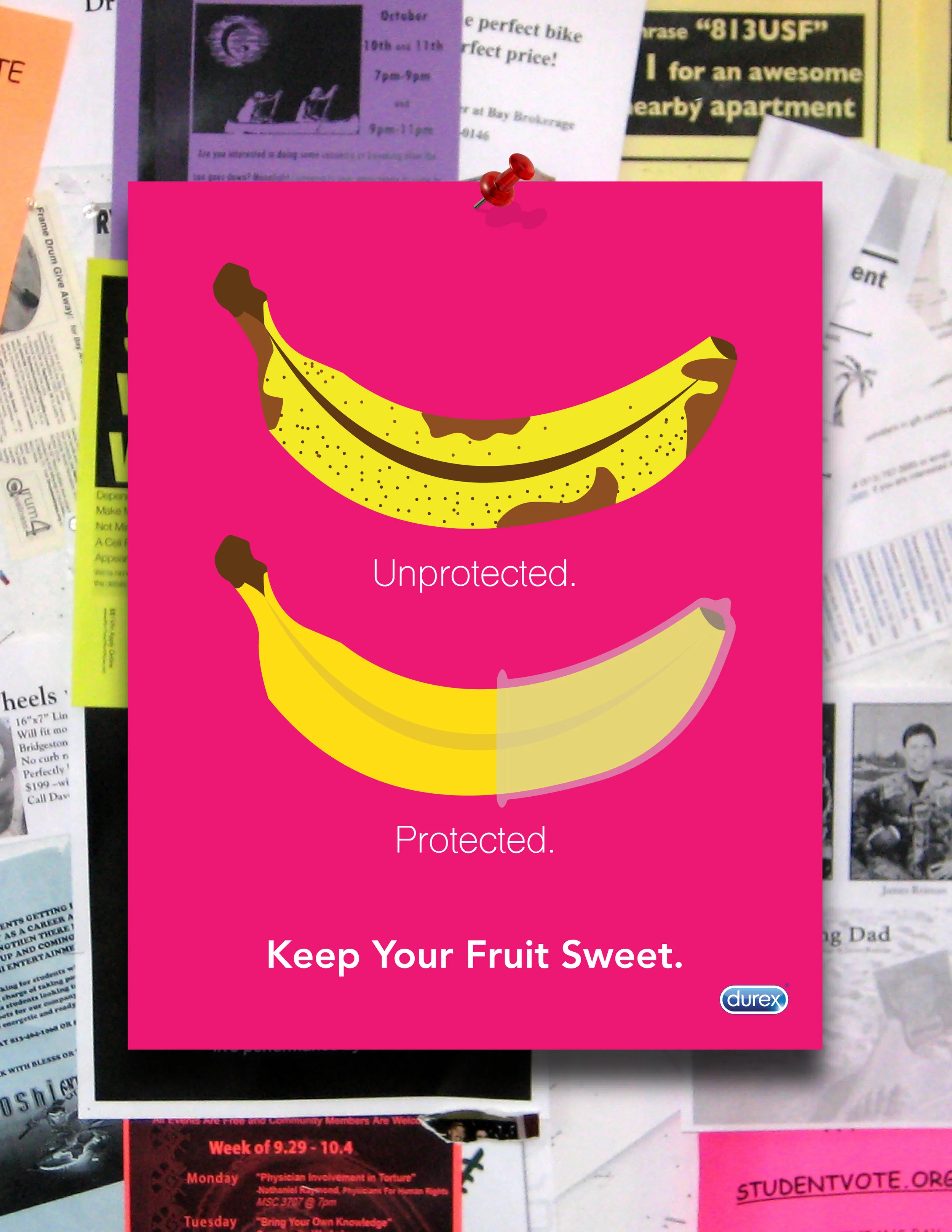
In this campaign, our design class was asked to create a safe sex poster for Durex. The case study said that the posters would be hung up around various college campuses and needed to stand out among other posters that may be on the wall. I drew inspiration from pop art in terms of colors and execution. I made the copy short, pithy, and witty. The poster itself is on brand with Durex’s recent advertising.
Working as a team member on University of Kentucky’s National Student Advertising Competition was the most rewarding, yet demanding project I have worked on through my college career. This competition was sponsored by the American Advertising Association and our client was Wienerschnitzel, the world’s largest hot dog chain. We were asked to create a category campaign, focusing on the Hot Dog itself and not the brand. First, I helped conduct and evaluate our focus groups, ensuring a solid foundation to our research. Once the research phases were complete, I moved on to help with creative side of the campaign. First, during a group brainstorm session, I suggested the tagline “Made For Your Crowd” which later evolved into “Hot Dogs. Made For Your Crowd”. This tagline drove the idea that Hot Dogs are a social, playful, and fun food. They are individualistic and unique, just like your crowd and the people you surround yourself with. Once we had our tagline, we were able to move into the visual executions. The visuals moved toward an illustrative, “doodletastic” direction. I had never worked off of a tablet before, but this proved to be the most efficient way to create the doodles. After working off of a borrowed Wacom tablet, I decided to invest in an IPad Pro at the end of the semester, to further my illustration skills. Upon completing this campaign, we won the district level, competed in semi-finals, and finished 10th in the nation out 125 teams! The multiple all nighters and gallons of coffee paid off, I couldn’t be more proud of the work our team put in.
After a trip to Rome, I brought some family friends back a sample of Limoncello. They liked it so much, they decided they would try their hand at making it themselves. DownLow Distillery was born, and I worked closely with them to make decisions on packaging and labeling. I researched traditional Italian Limoncello labels for inspiration. I took this research and created a label that was true to its roots, yet modern. The Limoncello received such incredible feedback, they decided to make Grapefruitcello and Orangecello. I worked to ensure the new additions were on brand and belonged together, but different enough to show the variety in flavors. The colors, layout, and lettering style combined creates a modern take on a classic Italian Liqueur.
In my Design in Advertising class, we were asked to redesign a book cover. I chose to work with The Great Gatsby, as it is one of my favorite books. I wanted to stay true to the classic, and also infuse modern touches in my design and type choices. The overall design speaks on the themes of Gatsby’s lavish parties and love for Daisy. It’s simple, yet eye catching with pops of red and champagne bubble accents.
This campaign was selected and implemented by the client’s marketing team, and was used to raise over $50,000.
In a team of four, we created a poster campaign for GleanKy. They have a unique mission of solving food insecurity and food waste in the community. GleanKy takes food from local grocery stores and farmers then redistributes to people of Kentucky in need. Those who are struggling with food insecurity have little access to healthy food and GleanKy connects this gap.
Our target audience were retired people who have a lot of free time on their plate, and we wanted to encourage them to use volunteering for GleanKy. We found through research that talking about children specifically appeals to retired people. Your grandma never lets you leave her house hungry, right? We worked closely with the GleanKy director to fully understand their mission and how the program itself works.
Contributors: Emi Deck, Rob Fischer, Jillian Jones, & Claire Monkman
In this project, we were asked to create a “passion project”. After reflecting on my wide range of interests, I decided to talk about the music I grew up with, Northern Soul. As the book explains, this genre of music started when the rejected soul music in the states was picked up and discovered in the Northern cities of England. Underground clubs like the Twisted Wheel, The Torch, and Wigan Casino. My Dad was born and raised in England and grew up attending these clubs. I decided to interview him to help me with research and write the book. Given he is just as passionate as I am about music, we ended up talking for three hours. I ditched my well planned out questions and it just turned into a long but interesting conversation. After transcribing a lot of audio and fact checking things like names and dates, I put it all together in a nicely laid out book. The photography is all mine, with a few exceptions found in archives. I plan on adding more pages to this book as I dig through the audio further!